A Mountain Plot is a useful graphical method for evaluating the distribution of differences between measurement methods. In MedCalc, it is included under Statistics → Method comparison & evaluation → Mountain plot and can be used for comparing two or three laboratory or measurement techniques.
This tutorial explains the Mountain Plot concept, its options, how to interpret the graph, and how it can be applied to biomedical and biological data.
Introduction
When two laboratory methods are used to measure the same biological variable, researchers need to determine whether the methods produce sufficiently similar results.
For example, a laboratory may compare:
- A reference glucose analyzer with a new analyzer
- Two hemoglobin measurement techniques
- Two cholesterol assays
- Two biochemical instruments
- A conventional laboratory method with a new diagnostic method
Simply calculating a correlation coefficient is not sufficient to establish agreement between measurement methods. Method-comparison techniques focus on the differences between measurements, rather than only their association.
One useful graphical approach is the Mountain Plot, also known as a folded empirical cumulative distribution plot. MedCalc describes it as a complementary method to the Bland–Altman plot.
What Is a Mountain Plot?
A Mountain Plot displays the distribution of differences between a new measurement method and a reference method.
MedCalc calculates a percentile for each ranked difference and then folds the upper half of the cumulative distribution around the 50th percentile. The resulting distribution produces the characteristic “mountain” appearance.
The Mountain Plot is particularly useful because it makes it easier to examine:
- The central part of the distribution
- The median difference
- The spread of differences
- The tails of the distribution
- Large differences
- Differences between multiple analytical methods
It is especially useful when the differences are not normally distributed, because the Mountain Plot does not require the same normal-distribution interpretation used in a conventional parametric Bland–Altman analysis. MedCalc specifically notes that the plot makes the central 95% of the data easier to identify even when the data are not normally distributed.
Mountain Plot in MedCalc
In MedCalc, the analysis is located under:
Statistics → Method comparison & evaluation → Mountain plot
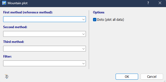
The MedCalc dialog allows you to enter two or three laboratory assays. When three assays are entered, the second and third assays are compared with the first assay, which acts as the reference method.
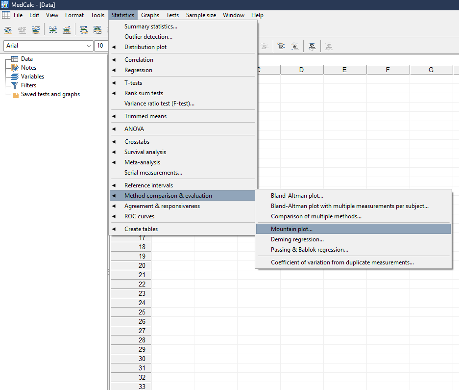
Mountain Plot Options in MedCalc
1. First Method – Reference Method
The First method is the reference method.
For example:
Reference Analyzer
This method provides the reference measurements against which the other methods are compared.
The choice of reference method should be based on the study design and scientific justification. It should not simply be selected because its values are numerically higher or lower.
2. Second Method
The Second method represents the first method being evaluated against the reference.
For example:
Analyzer B
MedCalc calculates the differences between Analyzer B and the reference analyzer and displays their distribution in the Mountain Plot.
3. Third Method
MedCalc also allows a Third method.
For example:
Analyzer C
When a third method is included, both Analyzer B and Analyzer C are compared with the same reference analyzer. This makes it possible to visually compare the distributions of differences between several methods.
This is particularly useful in laboratory studies where several analytical platforms are being evaluated against one established method.
4. Filter
The Filter option allows a subset of the dataset to be analyzed.
For example, a biomedical dataset might contain:
- Male and female participants
- Different age groups
- Different disease groups
- Different treatment groups
- Different clinical centers
A filter can be useful when the researcher wants to evaluate only a specific subgroup.
5. Dots – Plot All Data
The Dots (plot all data) option displays the individual observations on the Mountain Plot.
This option is useful because it allows the researcher to see individual observations rather than relying only on the folded distribution.
MedCalc specifically notes that displaying all data points can help identify possible outliers.
For exploratory biomedical analysis, keeping this option selected can therefore provide additional information about the observed differences.
Example Biomedical Dataset
For demonstration, consider a hypothetical clinical chemistry study comparing three glucose analyzers.
| Patient | Reference Analyzer | Analyzer B | Analyzer C |
|---|---|---|---|
| 1 | 100 | 98 | 101 |
| 2 | 110 | 108 | 111 |
| 3 | 120 | 118 | 121 |
| 4 | 130 | 128 | 131 |
| 5 | 140 | 138 | 141 |
| 6 | 150 | 148 | 151 |
| 7 | 160 | 158 | 161 |
| 8 | 170 | 168 | 171 |
| 9 | 180 | 178 | 181 |
| 10 | 190 | 187 | 191 |
Reference Analyzer: First method
Analyzer B: Second method
Analyzer C: Third method
These values are illustrative tutorial data, not clinical reference data.
The purpose is simply to demonstrate how differences between analytical methods can be visualized.
📥 Download the Example Dataset
Understanding Your Mountain Plot
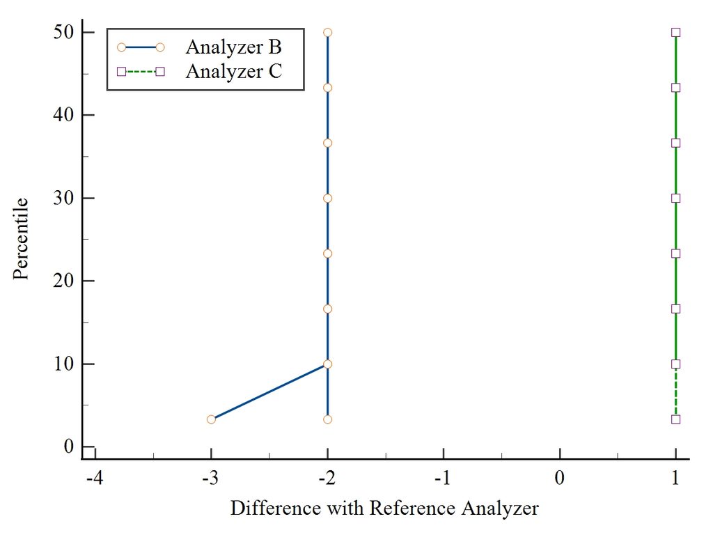
- Analyzer B
- Analyzer C
The X-axis is:
Difference with Reference Analyzer
The Y-axis is:
Percentile
The graph therefore shows how the differences between each analyzer and the reference analyzer are distributed across percentiles.
Analyzer B
In your attached plot, the Analyzer B distribution is concentrated around approximately −2 units, with observations extending toward approximately −3 units.
This indicates that the differences between Analyzer B and the reference analyzer are predominantly negative in this illustrative dataset.
In other words, Analyzer B tends to produce measurements that are lower than the reference analyzer.
Analyzer C
Analyzer C is concentrated around approximately +1 unit.
This indicates that Analyzer C tends to produce measurements that are slightly higher than the reference analyzer.
Therefore, the two methods show different locations of their difference distributions.
How to Interpret the Mountain Plot Scientifically
The most important features to examine are the location, spread and tails of the distributions.
1. Location of the distribution
If a method is unbiased relative to the reference method, its difference distribution should be centered around zero.
A distribution shifted to the negative side indicates predominantly negative differences.
A distribution shifted to the positive side indicates predominantly positive differences.
MedCalc explains that if two assays are unbiased relative to each other, the Mountain Plot will be centered over zero.
2. Spread
A narrow distribution indicates that the differences are concentrated within a relatively small range.
A wider distribution indicates greater variability in the differences.
Therefore, two methods can have similar central locations but substantially different spreads.
3. Tails
Long tails indicate relatively large differences between the methods.
Consequently, the researcher should not focus only on the central part of the plot. The tails may reveal observations where the two measurement methods differ considerably.
Result Table Format
For a scientific report or thesis, the Mountain Plot can be accompanied by a summary table.
| Method | Reference Method | Direction of Difference | Approximate Central Difference | Interpretation |
|---|---|---|---|---|
| Analyzer B | Reference Analyzer | Negative | −2 units | Measurements tend to be lower than reference |
| Analyzer C | Reference Analyzer | Positive | +1 unit | Measurements tend to be higher than reference |
Note: The approximate values above describe the attached illustrative plot and should not be treated as formal estimates unless confirmed from the MedCalc numerical output.
For publication, the exact numerical results should be taken from the MedCalc output rather than estimated visually from the graph.
Mountain Plot vs Bland–Altman Plot
The Mountain Plot should not be viewed as a replacement for the Bland–Altman plot.
Instead, it is a complementary graphical method. MedCalc specifically describes the Mountain Plot as complementary to the Bland–Altman plot.
| Feature | Mountain Plot | Bland–Altman Plot |
|---|---|---|
| Main purpose | Distribution of differences | Agreement and bias |
| Focus | Distribution and percentiles | Difference versus measurement magnitude |
| Normality assumption | Useful without requiring normal distribution | Conventional method commonly uses mean and SD |
| Central 95% | Easy to visualize | Examined using limits of agreement |
| Outliers | Can be explored using plotted observations | Can be directly examined |
| Multiple methods | Can display multiple distributions | Separate comparisons generally required |
The Bland–Altman approach directly examines bias and limits of agreement, whereas the Mountain Plot provides another way to visualize the distribution of paired differences.
Applications in Biological Sciences
Mountain Plots can be useful in many biological and biomedical research areas.
Clinical Biochemistry
Researchers can compare:
- Glucose analyzers
- Cholesterol assays
- Creatinine measurements
- Urea measurements
- Liver enzyme assays
Hematology
Possible applications include comparing:
- Hemoglobin analyzers
- RBC measurements
- WBC measurements
- Platelet counts
Immunology
The technique can be applied to comparisons involving:
- ELISA measurements
- Antibody concentrations
- Immunoassay platforms
Molecular Diagnostics
Researchers may compare measurements obtained from:
- Different laboratory instruments
- Different analytical platforms
- Different assay techniques
Medical Device Validation
A new device can be compared with an established measurement technique to examine the distribution of measurement differences.
Important Scientific Consideration
A Mountain Plot by itself does not establish clinical interchangeability.
The researcher must define what magnitude of difference is clinically or scientifically acceptable.
For example, a difference of 1 mg/dL may be negligible for one measurement but clinically important for another.
Therefore, the interpretation should consider:
- Clinical allowable error
- Analytical variation
- Biological variation
- Study population
- Measurement units
- Reference method
- Intended clinical application
The Mountain Plot should therefore be interpreted together with the appropriate numerical analysis and other method-comparison approaches.
Conclusion
The Mountain Plot in MedCalc is a useful graphical tool for examining the distribution of differences between measurement methods.
It is particularly valuable in biomedical method-comparison studies because it allows researchers to examine the location, spread and tails of the difference distributions.
In the attached example, Analyzer B shows a predominantly negative difference relative to the reference analyzer, whereas Analyzer C shows a predominantly positive difference. This demonstrates how the Mountain Plot can reveal systematic differences between analytical methods.
The method is especially useful as a complement to Bland–Altman analysis, particularly when researchers want to examine the empirical distribution of differences and compare multiple methods visually.
For a biomedical research paper, however, the graphical interpretation should be supported by exact numerical results and predefined criteria for acceptable analytical or clinical differences.