Introduction
In biostatistics, data visualization is more than just creating charts—it’s about transforming complex datasets into clear, meaningful insights that drive biological and medical research forward. With the rapid growth of biological data, researchers now handle vast and multidimensional datasets that require intuitive visual tools for analysis and communication.
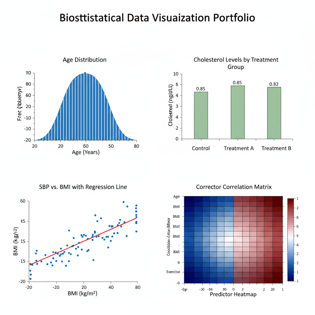
Data visualization bridges the gap between raw data and scientific understanding. Whether it’s displaying gene expression levels, illustrating patient survival rates, or mapping disease prevalence, effective visualization simplifies complex relationships. By using visual techniques like histograms, box plots, scatter plots, and heatmaps, biostatisticians can identify trends, correlations, and anomalies that may otherwise remain hidden in tables of numbers.
This article explores the role of data visualization in biostatistics, types of visualization techniques used, tools preferred by researchers, and the principles behind effective graphical representation. You’ll also learn best practices for presenting biostatistical results visually in publications, reports, and presentations.
1. Importance of Data Visualization in Biostatistics
Data visualization plays a vital role in converting complex biostatistical findings into understandable insights. In biomedical research, where large volumes of data are analyzed for trends and patterns, visualization aids in:
- Exploring relationships between variables
- Identifying outliers and anomalies
- Communicating findings effectively to non-statistical audiences
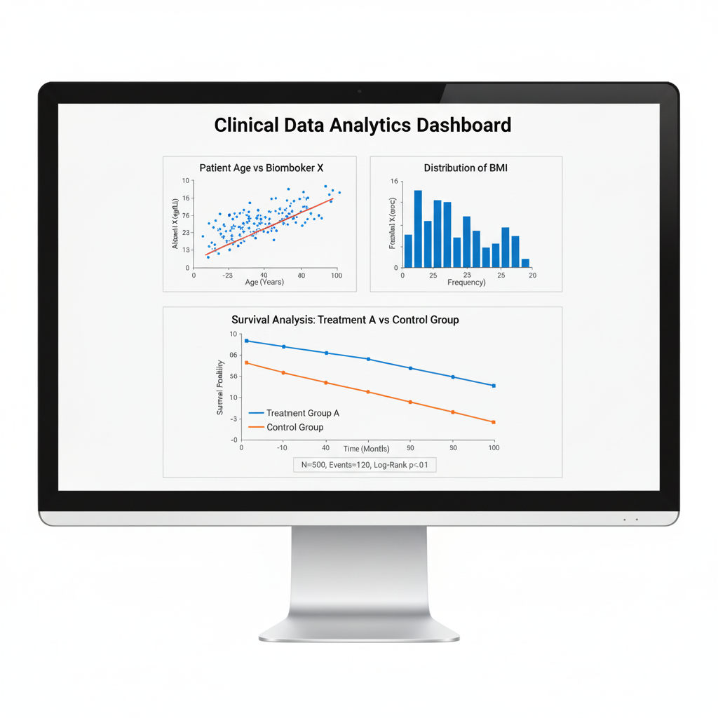
For instance, a scatter plot of cholesterol levels versus blood pressure can instantly reveal correlations, while a Kaplan-Meier survival curve shows the proportion of patients surviving over time.
2. Common Visualization Techniques in Biostatistics
Different visualization types serve distinct analytical purposes. Below is a summary of widely used methods:
| Visualization Type | Purpose | Common Use in Biostatistics |
|---|---|---|
| Histogram | Displays frequency distribution | Analyzing data spread (e.g., age or weight distribution) |
| Box Plot | Summarizes data variation | Comparing groups in experiments |
| Scatter Plot | Shows relationship between variables | Correlation and regression analysis |
| Violin Plot | Combines box plot and density plot | Visualizing data distribution |
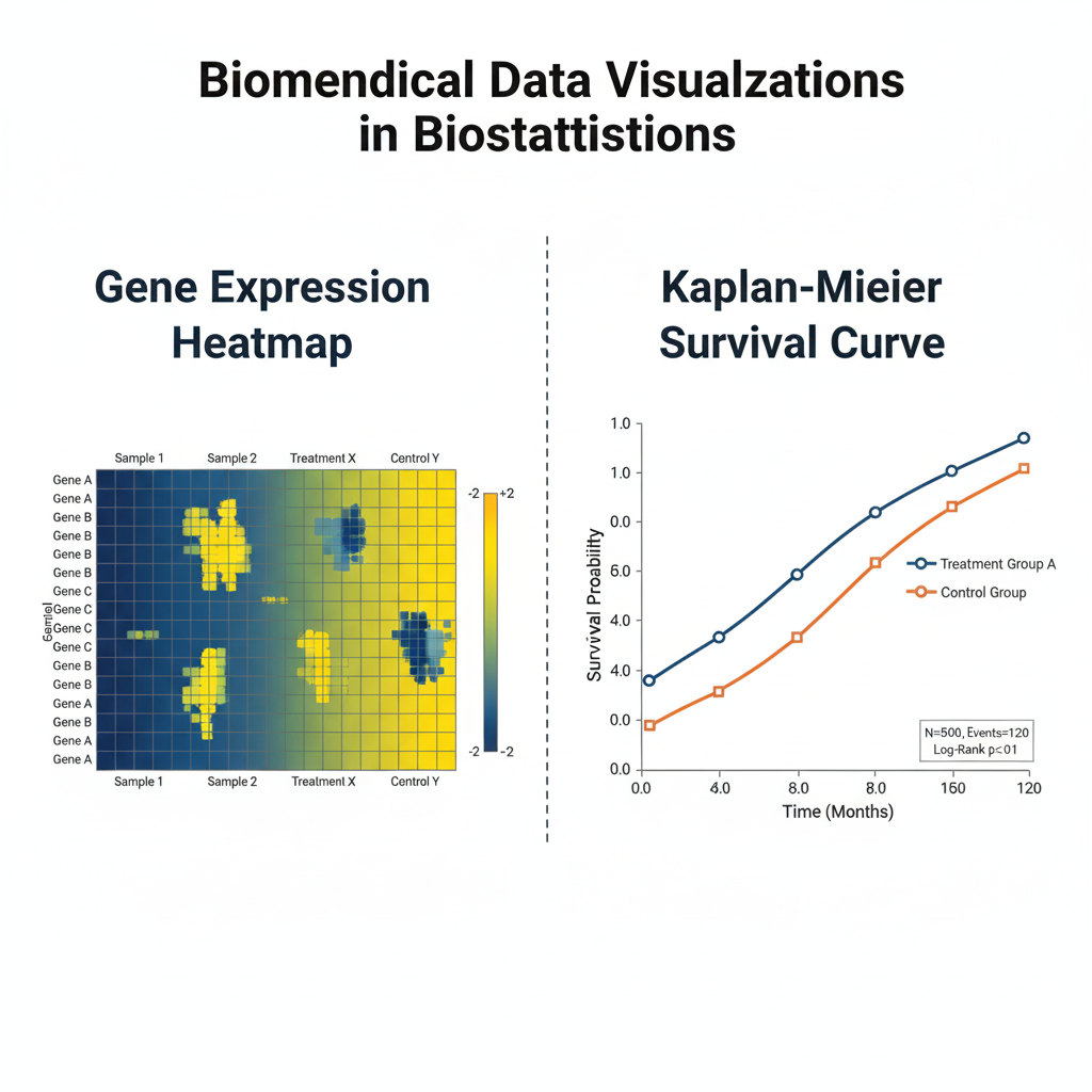
| Heatmap | Represents matrix data values | Gene expression, correlation matrices |
| Kaplan-Meier Curve | Plots survival probability | Clinical survival analysis |
| Forest Plot | Displays effect sizes in studies | Meta-analysis representation |
| Network Plot | Visualizes inter-variable relationships | Genetic and microbial interaction analysis |
3. Data Visualization Tools for Biostatisticians
Biostatisticians use a range of software tools to generate accurate, high-quality visualizations. These tools provide flexibility in handling biological data formats and statistical outputs.
| Tool/Software | Key Features | Best Use Case |
|---|---|---|
| R (ggplot2, plotly) | Advanced statistical graphics | Research publication-quality plots |
| Python (Matplotlib, Seaborn) | Custom visualization scripting | Reproducible data analysis |
| Tableau / Power BI | Interactive dashboards | Real-time biomedical data monitoring |
| GraphPad Prism | Built-in statistical tests + plots | Laboratory data analysis |
| MedCalc / PAST | Simple GUI-based visuals | Quick biostatistical chart creation |
4. Principles of Effective Data Visualization
Creating powerful visualizations is not just about aesthetics—it’s about communication. The following principles guide the development of effective biostatistical visuals:
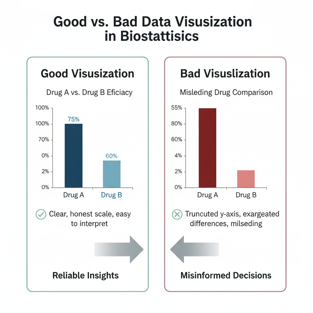
- Clarity – Ensure that the message is immediately understandable. Avoid clutter or overly complex designs.
- Accuracy – Represent data truthfully without distortion (e.g., consistent scales, zero-baselines).
- Context – Provide adequate labels, legends, and titles to help readers interpret results.
- Comparability – Use uniform scales and visual formats when comparing groups or time points.
- Accessibility – Use color palettes that are color-blind-friendly and readable when printed in grayscale.
5. Applications of Data Visualization in Biomedical and Clinical Research
Data visualization supports a wide range of applications in biostatistics and biomedical science, including:
a. Epidemiological Studies
Visualizing disease patterns across regions using maps and trend charts helps in tracking outbreaks (e.g., COVID-19 incidence visualization).
b. Genomics and Proteomics
Heatmaps and network plots display gene expression profiles or protein interactions, simplifying high-dimensional molecular data.
c. Clinical Trials
Kaplan-Meier survival curves, forest plots, and box plots help assess treatment efficacy and safety over time.
d. Environmental and Ecological Studies
Scatter plots, diversity indices, and ordination diagrams show species distribution and ecosystem patterns.
e. Public Health Analytics
Dashboards combining bar charts, trend lines, and pie charts display vaccination rates or mortality statistics.
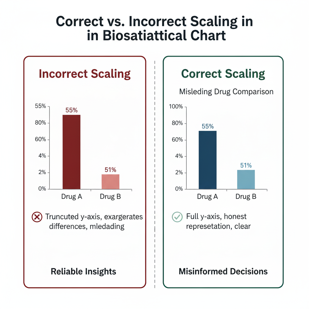
6. Common Mistakes and How to Avoid Them
Even well-intentioned visualizations can mislead if not designed properly. Avoid the following pitfalls:
| Mistake | Problem Caused | Solution |
|---|---|---|
| Improper scaling | Exaggerates or hides trends | Maintain consistent axis scales |
| Too many colors | Confuses interpretation | Limit to 3–5 meaningful colors |
| Missing context | Misleads audience | Add titles, captions, and legends |
| Overplotting | Obscures data patterns | Use transparency or sampling |
| Ignoring accessibility | Excludes some viewers | Choose color-blind-safe palettes |
7. Best Practices for Publishing Data Visualizations
When including figures in research articles or reports:
- Use vector graphics (SVG, PDF) for publication-quality output.
- Always label axes and include statistical annotations where applicable.
- Maintain consistent color themes across all figures.
- Include a caption explaining the statistical context of the figure.
- For online publication, consider interactive visualizations to allow user engagement.
8. Future of Data Visualization in Biostatistics
With the integration of machine learning and artificial intelligence, future biostatistical visualization will move beyond static plots. Predictive models will generate real-time visuals that adapt as new data streams in. Additionally, 3D visualization, VR/AR interfaces, and interactive dashboards are set to redefine how researchers explore biological complexity.
Conclusion
Data visualization stands as one of the most essential pillars in biostatistics, bridging the divide between data and decision-making. It transforms raw numerical data into comprehensible and actionable insights, enabling researchers, clinicians, and policymakers to make informed choices.
Whether analyzing clinical trial outcomes, modeling population genetics, or visualizing ecological diversity, effective visual design enhances understanding, communication, and transparency. As the volume of biomedical data continues to expand, mastering data visualization will remain a critical skill for every biostatistician.
In essence, visualization doesn’t just illustrate data—it tells the story behind it.