Introduction
In biomedical research and clinical data analysis, understanding how categorical variables are distributed is essential. One of the simplest yet most powerful tools for this purpose is the frequencies bar chart. Software like MedCalc makes it easy to generate such visualizations with minimal effort while maintaining scientific accuracy.
A frequencies bar chart visually represents how often each category occurs in a dataset. Whether you are analyzing patient characteristics, disease prevalence, or experimental outcomes, this chart helps convert raw data into meaningful insights.
In this article, you’ll learn everything about frequencies bar charts in MedCalc—from definition and concepts to step-by-step creation, interpretation, and practical examples.
What is a Frequencies Bar Chart?
A frequencies bar chart is a graphical representation where categorical data is displayed using rectangular bars. The height (or length) of each bar corresponds to the frequency or percentage of observations in that category.
Key Features:
- Represents categorical variables (e.g., Gender, Blood Pressure Category)
- Bars can show counts or percentages
- Easy comparison between groups
- Widely used in biostatistics and medical research
Concept Explanation
Before creating a frequencies bar chart in MedCalc, it’s important to understand the underlying concept.
1. Frequency
The number of times a category appears in the dataset.
2. Relative Frequency
The proportion of a category relative to the total sample.
3. Percentage Frequency
Percentage=Total ObservationsFrequency×100
4. Grouped Comparison
Frequencies can be compared across groups (e.g., Male vs Female).
Types of Frequencies Bar Charts in MedCalc
1. Simple Bar Chart (Grouped)
Displays categories side by side
Useful for comparing groups
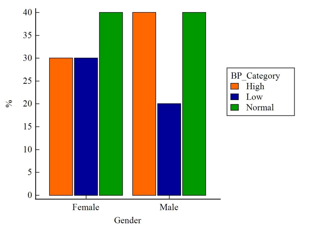
Example: Male vs Female across BP categories
2. 100% Stacked Bar Chart
Each bar totals 100%
Shows proportion within each group
Useful for composition analysis
Step-by-Step: Creating Frequencies Bar Chart in MedCalc
Follow these steps to generate the chart:
Step 1: Prepare Your Data
Create a dataset with categorical variables.
Example Dataset
| Gender | BP_Category |
|---|---|
| Female | High |
| Female | Low |
| Male | Normal |
| Male | High |
Step 2: Open Data in MedCalc
- Launch MedCalc
- Enter data manually or import from Excel
👉 Download Example Dataset (Excel)
Step 3: Navigate to Graph Options
- Click Graphs → Bar chart → Frequencies
Step 4: Select Variables
- Choose:
- Category Variable → BP_Category
- Grouping Variable → Gender
Step 5: Choose Chart Type
- Select:
- Grouped Bar Chart OR
- 100% Stacked Bar Chart
Step 6: Customize Graph
- Set:
- Y-axis → Percentage (%)
- Colors for categories
- Legend position
Step 7: Generate Chart
Click OK to create the visualization.
Example Explanation
1. Grouped Bar Chart Interpretation
- Female:
- High: 30%
- Low: 30%
- Normal: 40%
- Male:
- High: 40%
- Low: 20%
- Normal: 40%
Insights:
- Both genders have equal normal BP (40%)
- Males show higher high BP prevalence
- Females have more low BP cases
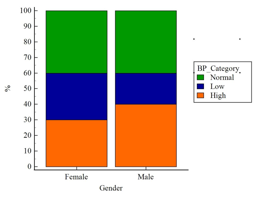
2. 100% Stacked Bar Chart Interpretation
- Each bar totals 100%
- Helps compare proportions visually
Insights:
- Male population shows a shift toward high BP
- Female distribution is more balanced
- Normal BP is consistent across both genders
Plot Interpretation Tips
When analyzing frequencies bar charts:
✔ Look for Patterns
- Which category dominates?
✔ Compare Groups
- Are there differences between Male and Female?
✔ Identify Outliers
- Any unusually high or low values?
✔ Check Proportions
- Especially in stacked charts
Advantages of Frequencies Bar Chart
- Simple and easy to understand
- Ideal for categorical data
- Helps in quick comparison
- Widely accepted in research publications
Limitations
- Not suitable for continuous data
- Limited detail compared to advanced plots
- Can become cluttered with many categories
Conclusion
The frequencies bar chart in MedCalc is an essential visualization tool for biostatistics and medical data analysis. It transforms raw categorical data into clear, interpretable visuals, allowing researchers to quickly identify trends, compare groups, and communicate findings effectively.
By mastering both grouped and 100% stacked bar charts, you can enhance your analytical workflow and present your data more professionally. Whether you’re a student, researcher, or healthcare analyst, this technique is a must-have skill in your statistical toolkit.