
Introduction
In biostatistics and data analysis, visualizing the distribution of a dataset is one of the first steps toward understanding its underlying patterns. Among various visualization tools, the box plot (or box-and-whisker plot) stands out as a powerful method for summarizing numerical data across different groups. It shows the median, quartiles, outliers, and overall spread of your data, providing a clear insight into its variability and central tendency.
In this article, we will explore how to create and customize a box plot in R using the ggplot2 package. We’ll start by generating a small biological dataset and then walk through each step of the R script to produce a publication-ready visualization. This guide is suitable for students, researchers, and scientists working with plant, animal, or microbial growth datasets in biological sciences.
What Is a Box Plot?
A box plot is a graphical representation of numerical data through their quartiles. It helps identify:
- The median (Q2) – middle value of the dataset
- The lower (Q1) and upper quartiles (Q3) – indicating the interquartile range (IQR)
- Whiskers – showing the minimum and maximum range (excluding outliers)
- Outliers – individual points that fall outside 1.5×IQR from the box
In biological research, box plots are widely used to compare data across experimental groups — for example, plant height under different fertilizer treatments, enzyme activity under various pH levels, or biomarker concentration across species.
Installing and Loading ggplot2
The R package ggplot2 is one of the most widely used visualization tools for scientific graphics. It allows flexible customization and professional-quality plots suitable for research publication.
# Install ggplot2 if not already installed
install.packages("ggplot2")
library(ggplot2)
Explanation:
- The
install.packages("ggplot2")command ensures ggplot2 is available in your R environment. library(ggplot2)loads the package, making its functions accessible.
Step 1: Creating a Biological Dataset
In our example, we create a simple dataset representing plant height (in cm) measured under three treatment conditions — Control, Fertilizer A, and Fertilizer B.
# Step 1: Create biological dataset
plant_data <- data.frame(
  Treatment = rep(c("Control", "Fertilizer A", "Fertilizer B"), each = 5),
  Height_cm = c(
    14.2, 13.8, 15.1, 14.8, 13.5,    # Control
    16.5, 17.2, 15.9, 16.8, 17.5,    # Fertilizer A
    18.4, 19.1, 18.8, 19.6, 18.9     # Fertilizer B
  )
)
Explanation:
data.frame()creates a data table in R.- The
Treatmentvariable is a categorical factor with three groups. - The
Height_cmvariable is continuous, representing measured plant heights. - The
rep()function repeats the treatment names five times each, matching the five observations per treatment.
After running this code, you can view your dataset using:
print(plant_data)
This will display 15 observations with corresponding treatments and height values.
| Treatment | Height_cm |
|---|---|
| Control | 14.2 |
| Control | 13.8 |
| … | … |
| Fertilizer B | 18.9 |
Step 2: Creating and Customizing the Box Plot
Now that we have our dataset, we can use ggplot2 to visualize it.
ggplot(plant_data, aes(x = Treatment, y = Height_cm, fill = Treatment)) +
  geom_boxplot(outlier.colour = "red", outlier.shape = 17, outlier.size = 3) +
  labs(
    title = "Plant Height by Treatment",
    subtitle = "Comparison of growth under different fertilizer conditions",
    x = "Treatment Type",
    y = "Plant Height (cm)",
    fill = "Treatment"
  ) +
  scale_fill_manual(values = c("Control" = "lightgreen", "Fertilizer A" = "skyblue", "Fertilizer B" = "orange")) +
  theme_minimal(base_size = 14) +
  theme(
    plot.title = element_text(face = "bold", color = "darkgreen"),
    plot.subtitle = element_text(face = "italic"),
    axis.title.x = element_text(face = "bold"),
    axis.title.y = element_text(face = "bold"),
    legend.position = "right"
  )
Explanation of Each Line
ggplot(plant_data, aes(...))
This line initializes the ggplot object.
plant_datais the dataset.aes(x = Treatment, y = Height_cm, fill = Treatment)defines aesthetics: the x-axis is treatment type, the y-axis is height, and color fill depends on treatment.
geom_boxplot()
Adds the box plot layer.
outlier.colour = "red"colors the outlier points red.outlier.shape = 17uses triangle symbols for outliers.outlier.size = 3increases the size for visibility.
labs()
Adds titles and axis labels:
title– main title of the plotsubtitle– secondary descriptive linex,y– axis labelsfill– legend title
scale_fill_manual()
Customizes the fill colors for each group. This improves clarity and aesthetics:
- Control = light green
- Fertilizer A = sky blue
- Fertilizer B = orange
theme_minimal()
Applies a clean, minimalistic background suitable for scientific publications.base_size = 14 adjusts text size for readability.
theme()
Further customizes:
plot.titleandplot.subtitle– font style and coloraxis.title.xandaxis.title.y– bold axis titleslegend.position = "right"– places legend on the right side of the graph
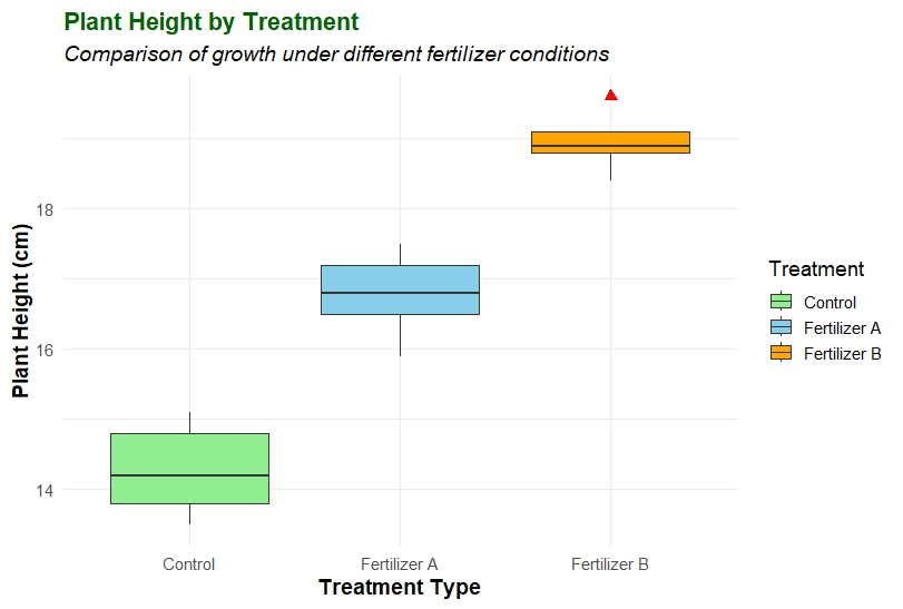
Interpreting the Box Plot
The resulting box plot visually summarizes how plant height varies among different fertilizer treatments.
- Control Group – The median height is around 14–15 cm, with a narrow interquartile range, indicating less variation in plant growth.
- Fertilizer A – Shows higher plant heights (~16–17.5 cm) and a slightly wider box, suggesting moderate variability.
- Fertilizer B – Displays the highest growth (~18–19.6 cm), indicating that Fertilizer B significantly improves plant height compared to the control.
The red points (outliers) help detect unusually high or low values, which might represent measurement errors or biological variability.
Tips for Publication-Ready Plots
When preparing figures for journal publications, follow these additional steps:
- Increase resolution – Use
ggsave("plot.png", dpi = 300)to export a high-quality image. - Consistent color palette – Choose colors that are colorblind-friendly and easy to distinguish in grayscale.
- Descriptive titles – Titles should clearly communicate the variable being compared.
- Statistical annotation – Add statistical significance levels (e.g., p-values or letters) using packages like
ggsigniforggpubr.
Common Errors and Solutions
| Error | Cause | Solution |
|---|---|---|
object 'ggplot2' not found | Package not loaded | Use library(ggplot2) |
Error: Aesthetics must be valid data columns | Wrong column name | Check spelling of variable names |
| Box plot not showing colors | Missing fill argument | Add fill = Treatment inside aes() |
| Outliers not visible | Data has no outliers | Try modifying outlier.shape or using different dataset |
Applications in Biostatistics
Box plots are widely used in biological and environmental studies for:
- Comparing plant growth under different nutrient conditions.
- Visualizing enzyme activity at varying pH or temperature levels.
- Assessing species abundance across habitats.
- Analyzing experimental replicates in agricultural trials.
By using ggplot2, you can create reproducible, high-quality visualizations that help communicate scientific findings effectively.
Conclusion
In this article, we demonstrated how to create and customize a box plot in R using ggplot2. From generating a sample dataset to applying visual enhancements, this workflow provides a simple yet powerful approach for data visualization in biostatistics.
A box plot is more than just a chart — it’s a summary of data distribution, highlighting medians, spread, and outliers. When paired with clear labeling, thoughtful color choices, and statistical annotations, it becomes an essential component of scientific reporting.
Whether you are analyzing plant growth, gene expression, or any continuous biological measurement, box plots help reveal group differences at a glance — a key step toward meaningful interpretation and publication.