Introduction
Fourier Transform Infrared (FTIR) spectroscopy is one of the most widely used analytical techniques for identifying functional groups and understanding molecular interactions in materials, chemicals, and biological samples. In many research studies, especially comparative experiments, it is necessary to overlay multiple FTIR spectra to observe similarities and differences among samples.
While raw FTIR output often lacks clarity, OriginPro provides powerful tools to customize, annotate, and present multiple FTIR graphs in a clean, publication-ready format. Proper customization improves readability, ensures reproducibility, and enhances the scientific value of spectral interpretation.
This article explains how to customize multiple FTIR spectra in OriginPro, using the attached figure as a reference. It also includes peak interpretation, best practices for axis formatting, color management, and guidance on where to add FTIR Excel datasets and FTIR files in a WordPress article.
Why Customize Multiple FTIR Graphs?
Customizing multiple FTIR spectra is essential for:
- Comparing functional groups across samples
- Highlighting chemical modifications or treatments
- Improving visual clarity for journals and theses
- Ensuring consistent axis scales and annotations
- Making spectra understandable for readers and reviewers
Overlay plots, when properly formatted, reduce redundancy and communicate complex spectral information efficiently.
Overview of the Attached FTIR Graph
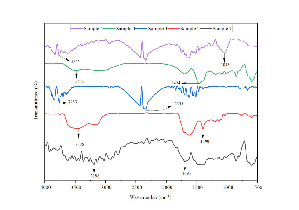
The attached figure shows five FTIR spectra (Sample 1–Sample 5) plotted together:
- X-axis: Wavenumber (cm⁻¹), decreasing from 4000 to 500
- Y-axis: Transmittance (%)
- Each spectrum is vertically offset for clarity
- Key absorption peaks are annotated with arrows and wavenumber values
Such formatting is typical for materials science, polymer chemistry, nanomaterials, and biological FTIR studies.
Step-by-Step: Customizing Multiple FTIR Graphs in OriginPro
1. Import FTIR Data
FTIR data is usually exported as Excel (.xlsx) or CSV files from the instrument software.
Steps in OriginPro:
- Open OriginPro
- Go to File → Import → Excel / ASCII
- Assign:
- Column A → Wavenumber (X)
- Column B onward → Transmittance (%) for different samples
Download FTIR Excel Datase
2. Plot Multiple FTIR Spectra
- Highlight all Y columns with the same X column
- Choose Plot → Multi-Y → Line
- Overlay all spectra in one graph layer
This produces a basic multi-line FTIR plot.
3. Reverse the Wavenumber Axis
FTIR spectra conventionally display wavenumber from high to low.
In OriginPro:
- Double-click X-axis
- Check Reverse
- Set range from 4000 to 500 cm⁻¹
4. Offset Spectra Vertically
To avoid overlap:
- Open Plot Details → Layer → Stack
- Apply Y-offset values
- Maintain uniform spacing between spectra
This creates a clean stacked FTIR plot, as seen in the attached image.
5. Customize Colors and Line Styles
Use distinct but soft colors:
| Sample | Color Suggestion |
|---|---|
| Sample 1 | Black |
| Sample 2 | Red |
| Sample 3 | Blue |
| Sample 4 | Green |
| Sample 5 | Violet |
- Line width: 1.5–2 pt
- Avoid markers for FTIR plots
6. Add Legends and Labels
- Rename legends as Sample 1, Sample 2, etc.
- Use consistent font (Times New Roman or Arial)
- Keep legend at the top or outside plot area
7. Annotate FTIR Peaks
Peak annotation is crucial for interpretation.
Steps:
- Use Text Tool / Arrow Tool
- Add arrows pointing to absorption bands
- Label with wavenumber values (e.g., 3438 cm⁻¹)
This transforms raw spectra into interpretable scientific figures.
FTIR Peak Interpretation (Based on Attached Graph)
The major absorption bands observed across the samples are summarized below.
Table: FTIR Peak Assignment and Interpretation
| Wavenumber (cm⁻¹) | Sample(s) | Functional Group Assignment |
|---|---|---|
| ~3763–3755 | Sample 3, 5 | Free O–H stretching |
| ~3471–3438 | Sample 2, 4 | Hydrogen-bonded O–H / N–H |
| ~3188 | Sample 1 | O–H stretching (strong H-bonding) |
| ~2335 | Sample 3 | CO₂ asymmetric stretching |
| ~1693 | Sample 1 | C=O stretching (carbonyl) |
| ~1454 | Sample 4 | CH₂ bending / aromatic C–C |
| ~1390 | Sample 2 | CH₃ bending |
| ~1045 | Sample 5 | C–O stretching |
Comparative Interpretation of Samples
- Sample 1 shows a strong carbonyl peak (~1693 cm⁻¹), indicating oxidation or ester/amide functionality.
- Sample 2 exhibits prominent O–H and CH₃ bending peaks, suggesting organic or polymeric material.
- Sample 3 displays a CO₂ band (~2335 cm⁻¹), possibly due to atmospheric absorption or carbonate presence.
- Sample 4 shows CH₂ and aromatic vibrations, indicating hydrocarbon structures.
- Sample 5 presents strong C–O stretching (~1045 cm⁻¹), suggesting alcohols or polysaccharides.
These variations confirm chemical differences among the samples, effectively visualized using customized multi-FTIR plots.
Conclusion
Customizing multiple FTIR graphs in OriginPro significantly enhances the clarity, interpretability, and publication quality of spectral data. By overlaying spectra, applying vertical offsets, annotating key peaks, and maintaining consistent formatting, researchers can effectively communicate chemical differences among samples.
The attached FTIR graph demonstrates how proper customization transforms complex spectral data into a clear scientific narrative. When combined with downloadable datasets and well-structured interpretation, such figures greatly improve the impact of research articles, theses, and presentations.