Introduction
Data visualization plays a crucial role in biostatistics, especially when interpreting complex statistical analyses such as Two-Way ANOVA. When comparing multiple groups, simply plotting mean values is not enough; researchers must also communicate statistical significance effectively. One of the most widely accepted methods is adding asterisks (*) with brackets to indicate significant differences between groups.
In this article, we will explore how to create a Two-Way ANOVA bar graph with standard deviation and Tukey post hoc test results using OriginPro. We will also guide you step-by-step on how to add significance brackets with asterisks, interpret the results, and properly present your findings.
Definition
Two-Way ANOVA (Analysis of Variance) is a statistical method used to evaluate the effect of two independent variables on a dependent variable simultaneously.
Tukey’s Honest Significant Difference (HSD) Test is a post hoc analysis used after ANOVA to identify which specific group means are significantly different.
Asterisk notation:
- → p ≤ 0.05 (significant)
- ** → p ≤ 0.01 (highly significant)
- *** → p ≤ 0.001 (very highly significant)
Concept Explanation
In your experiment:
- Factor 1: Fertilizer type (A, B, C)
- Factor 2: Treatment levels (Control, Ten, Twenty, Thirty)
- Dependent Variable: Soil Phosphorus Level (ppm)
The goal is to:
- Determine if fertilizers affect phosphorus levels
- Check if treatment levels influence outcomes
- Identify interaction effects
- Highlight pairwise differences using Tukey test
The graph you provided clearly shows:
- Mean values (bars)
- Standard deviation (error bars)
- Statistical significance (brackets + asterisks)
Step-by-Step Procedure in OriginPro
Step 1: Import Data
- Open OriginPro
- Go to File → Import → Excel
- Select your dataset (
data.xlsx) - Ensure columns are structured like:
| Fertilizer | Treatment | Value |
|---|
Download Dataset:
“The dataset used for this analysis can be downloaded from the link below:”
➡️ Download Excel File (data.xlsx)
Step 2: Arrange Data for Analysis
Convert data into grouped format:
- Columns: Control, Ten, Twenty, Thirty
- Rows: Fertilizer A, B, C
Step 3: Perform Two-Way ANOVA
- Go to Statistics → ANOVA → Two-Way ANOVA
- Assign:
- Factor A → Fertilizer
- Factor B → Treatment
- Response → Phosphorus values
- Enable:
- Interaction effects
- Post Hoc Test → Tukey
- Click OK
Step 4: Run Tukey Post Hoc Test
After ANOVA:
- Select Tukey HSD
- Choose confidence level (95%)
- Output pairwise comparisons
This generates:
- Mean differences
- p-values
- Significance levels
Step 5: Create Bar Graph with SD
- Highlight grouped data
- Go to Plot → Column/Bar → Grouped Columns
- Add error bars:
- Graph → Add Error Bars → Standard Deviation
Step 6: Add Asterisk and Brackets (Important Step)
Manual Method (Most Common)
- Go to Insert → Straight Line/Bracket Tool
- Draw brackets between groups
- Double-click bracket → adjust thickness/height
- Add text:
- Click Text Tool (T)
- Type:
*or**or***
- Place above bracke
Automatic Method (Optional)
- Use OriginPro App:
- “Significance Test & Plot” App
- It can auto-generate:
- Brackets
- p-values
- Asterisk labels
Example from Your Graph
Fertilizer A
- Control vs Ten → *** (highly significant)
- Control vs Twenty → ***
- Control vs Thirty → ***
- Ten vs Twenty → *
Fertilizer B
- Strong significance across all treatments (***)
- Highest increase seen at Thirty
Fertilizer C
- Moderate but significant increase
- All comparisons mostly ***
Plot Interpretation
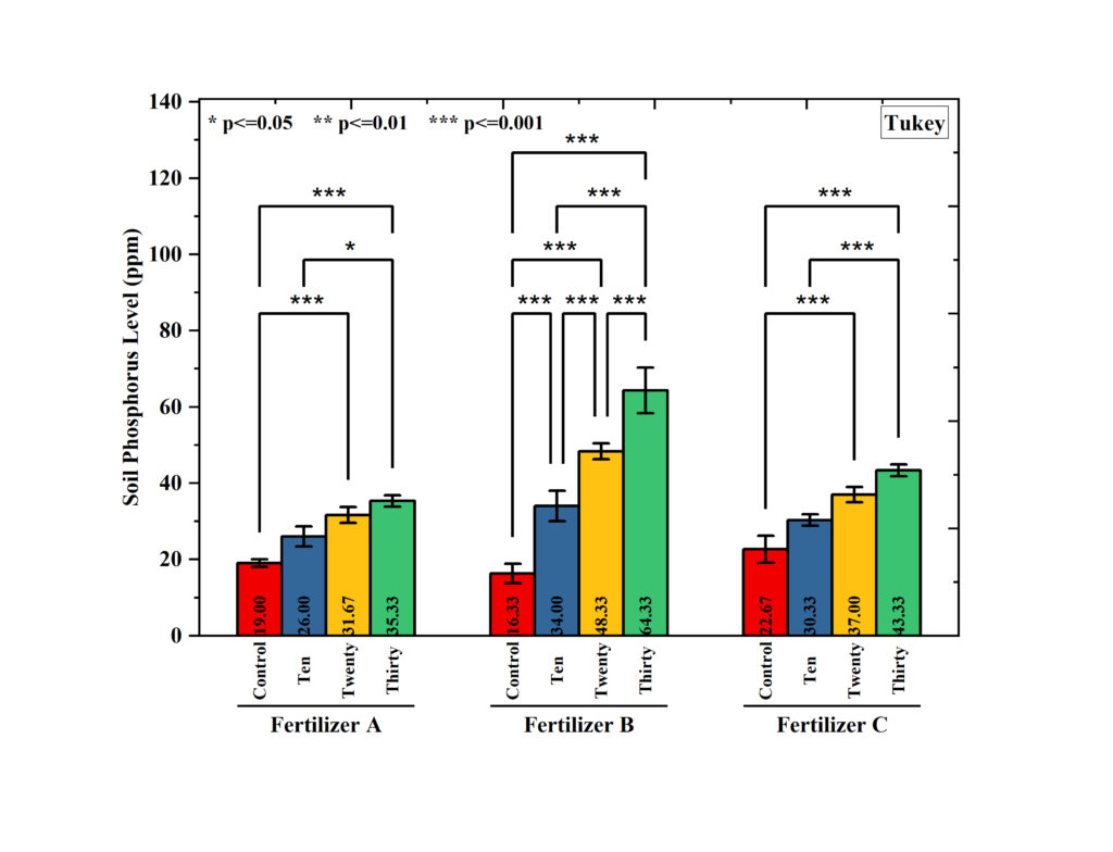
1. Overall Trend
- Phosphorus levels increase from Control → Thirty
- Indicates treatment effectiveness
2. Fertilizer Comparison
- Fertilizer B shows highest phosphorus levels
- Followed by C, then A
3. Statistical Significance
- Most comparisons show *** (p ≤ 0.001)
- Strong evidence of treatment effects
4. Interaction Effect
- Fertilizer and treatment together influence results
- Not just individual effects
Result Table Format
| Fertilizer | Comparison | Mean Difference | p-value | Significance |
|---|---|---|---|---|
| A | Control vs Ten | Significant | <0.001 | *** |
| A | Ten vs Twenty | Moderate | <0.05 | * |
| B | Control vs Thirty | Very High | <0.001 | *** |
| C | Ten vs Thirty | High | <0.001 | *** |
Conclusion
Adding asterisks with brackets to a Two-Way ANOVA bar graph is essential for clearly communicating statistical significance. Using OriginPro, researchers can efficiently perform ANOVA, apply Tukey post hoc analysis, and visually represent results with precision.
Your uploaded graph demonstrates a well-structured analysis where:
- Treatments significantly improve phosphorus levels
- Fertilizer type plays a critical role
- Statistical differences are clearly highlighted
By following this guide, you can create publication-quality graphs suitable for research papers, theses, and presentations.